PROJECT TYPE
Professional project at Ziggurat Technologies
TIMELINE
August - October 2020
TEAM
Josephine Aldora (UX Designer)
Anna Wu (UX Designer)
Trang Le (Frontend Developer)
Johnny Han (Software Engineer)
CONTRIBUTION
Research
Usability testing
Wireframing
Prototyping
Zivolve
Intelligent Trading Assistant App

How was the beta version challenging to use? ↓
In-app Feedback Form
Before jumping into a redesign, the first step I took was to empathize with our users and identify their pain points and concerns. There's an in-app feedback form where users can share technical issues, bugs and any other pain points they may have. I collected and read through user feedback gathered from the existing version of the app.

In-app Feedback Form
The current version is way too complicated!
Marco, Zivolve user

[Beta version of the app]
RESEARCH
User Interviews
In addition to the feedback form, I wanted to learn more and dig deeper for details on how users are using Zivolve and their problems when interacting with all features within Zivolve. Thus, I interviewed our top 6 most active users to learn more about their experience.

Empathy Map
We developed an empathy map to consolidate our research findings. Based on our initial user research, which involved gathering feedback and engaging with users directly, we crafted a customer empathy map to delve into their experiences, desires, and pain points.

Pain point #01 - Home Screen
Main features are listed vertically on home screen. It is difficult and inconvenient to switch between different features.

01
Key Takeaways
Pain point #02 - Stock Details
Stock Details contains lots of useful information! However, users feel that the data is cluttered and hard to read.

02
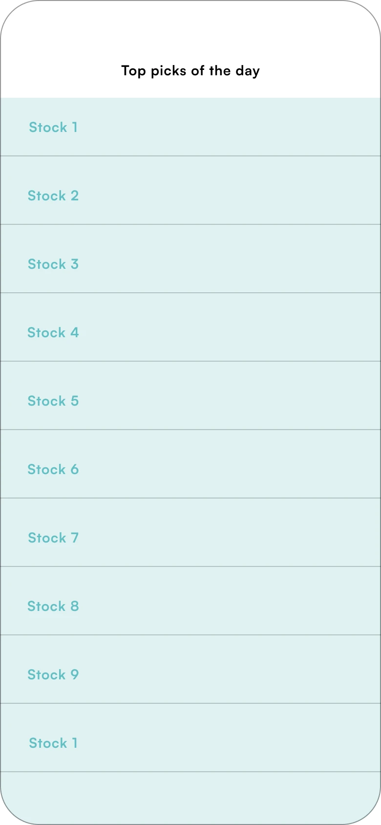
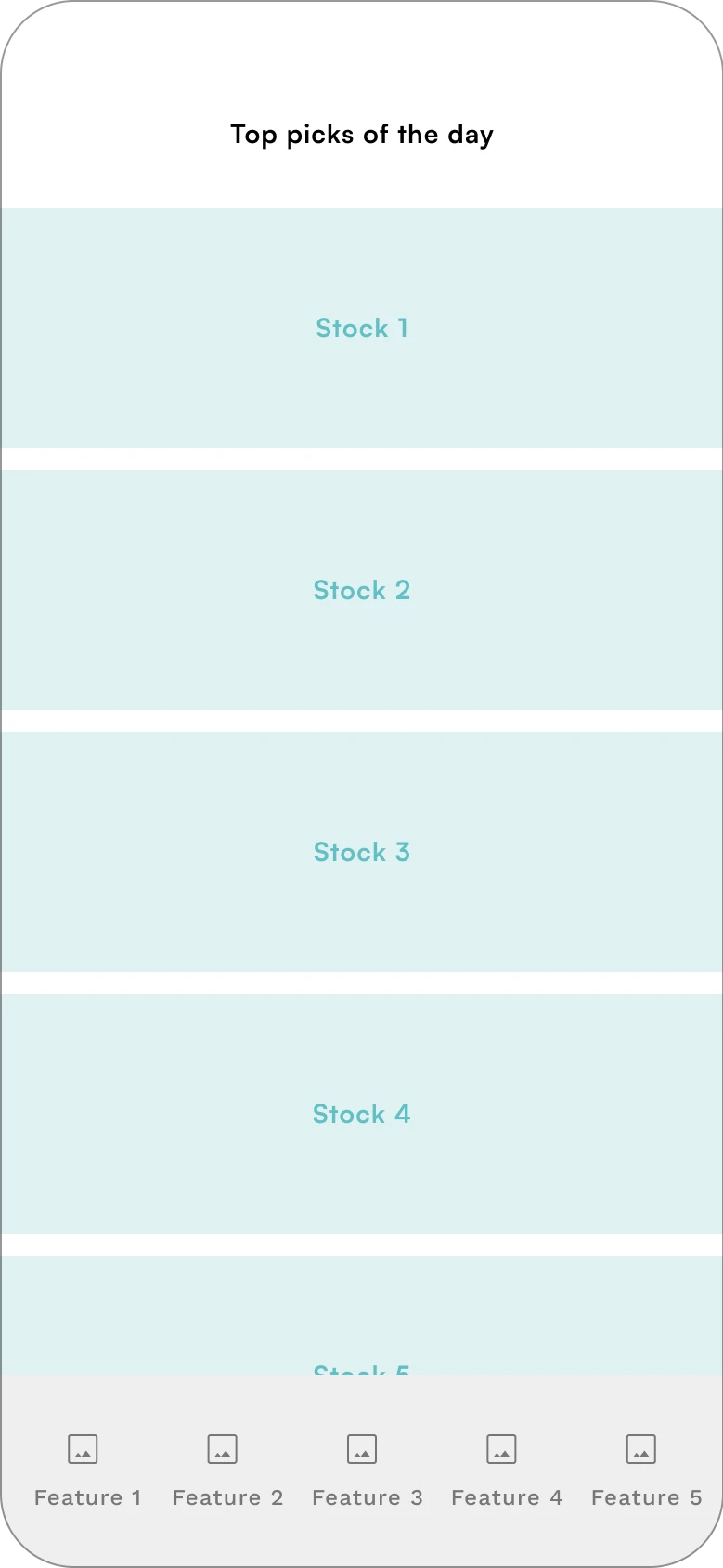
Pain point #03 - Top Picks
Top Picks is frequently used to check daily stock recommendations. Currently, stocks are presented in a list and can be overwhelming to some users with no way of telling which ones are to buy or sell.

03
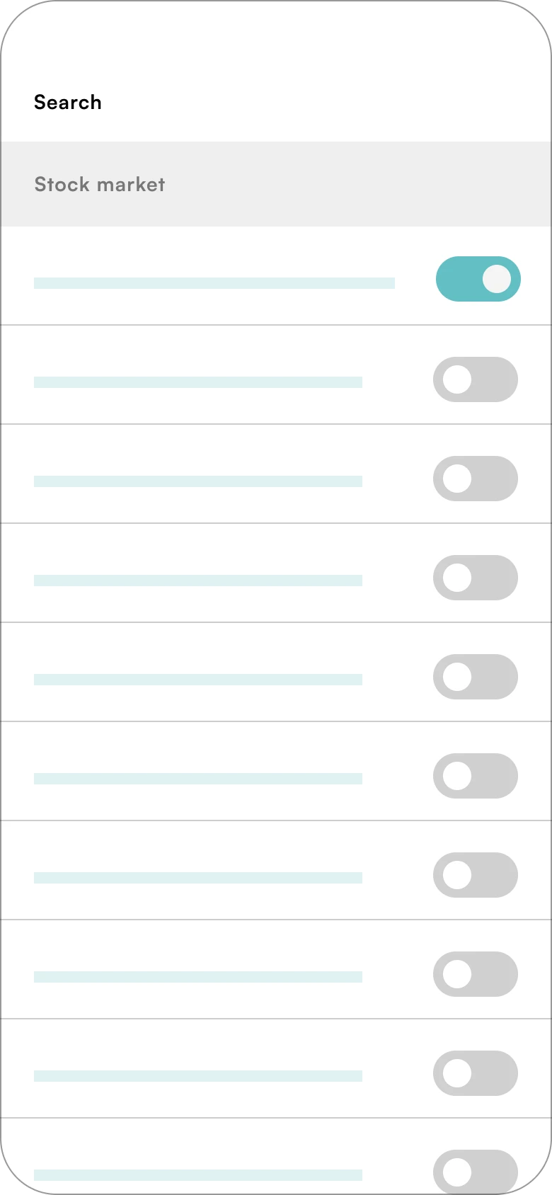
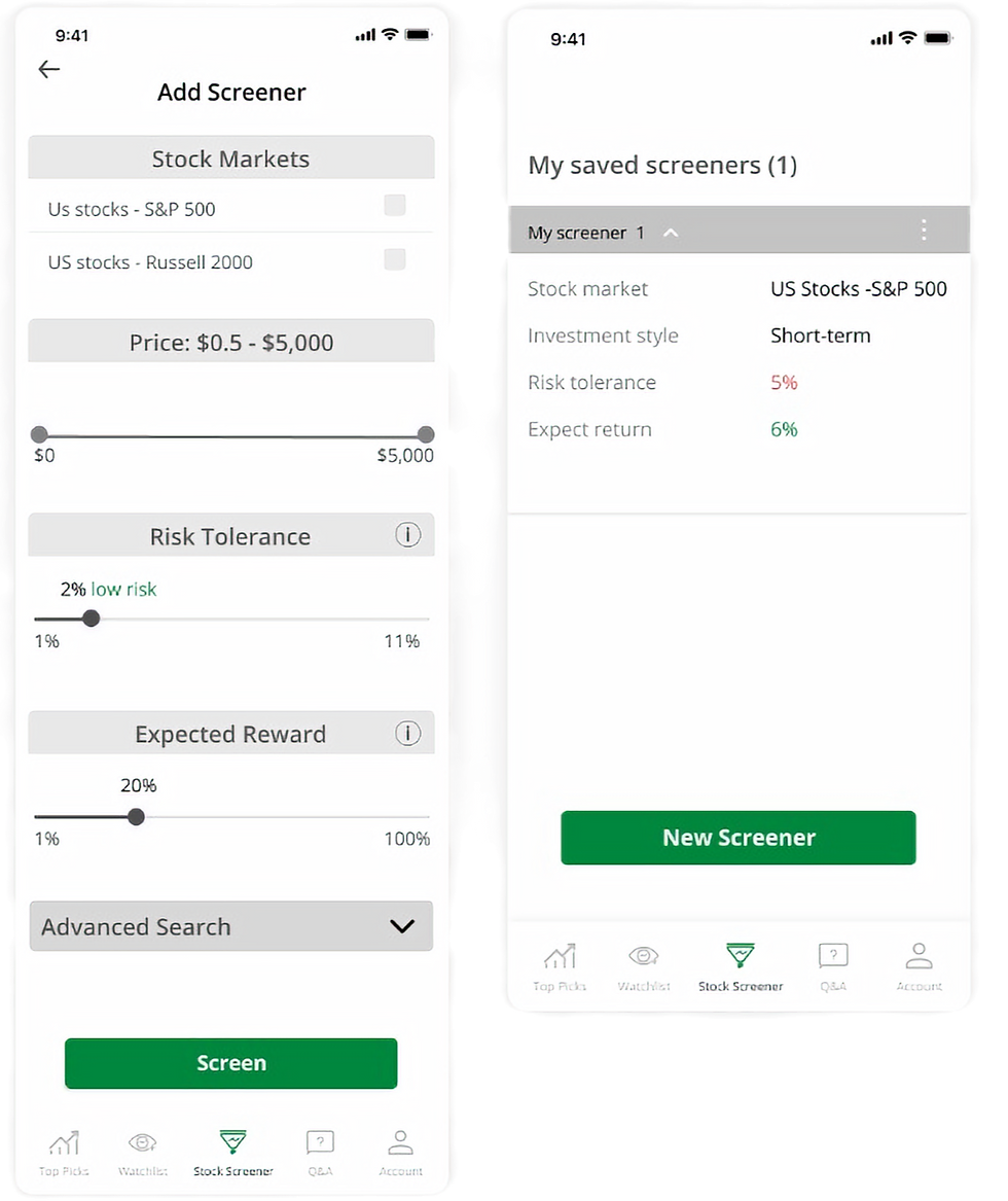
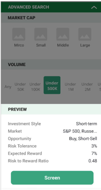
Pain point #04 - Search Filters (now called Screener)
Too many search toggles with no clear information hierarchy. Users also found this search filters list to be really long and sometimes forgot what they had selected.

04
Usability Testing
To ensure quality of the new design, we conducted a round of usability testing with 8 participants. We recruited existing users by sending an invite through email marketing and offered free three months of premium. Half of them have already used the beta version for a while. The other half are new users who are interested in this app.
User task list:
-
Create an account
-
You want to see a list of stock opportunities based on your risk tolerance and preferred market cap, where can you find this?
-
You have a trading-related question that you would like an expert’s opinion on. Where would you ask this question?
-
You come across an error when we’re filtering through your screener, where would you go to file a report?
0-2 Scale Completion
0: User can’t perform task
1: User performed task but has struggles
2: User can perform task quickly and with no trouble
This round of usability testing put focus on the main use case of completing tasks on the app and uncover any usability flaws. I used the 0-2 scale completion rating to measure task success rate.
Key Findings:
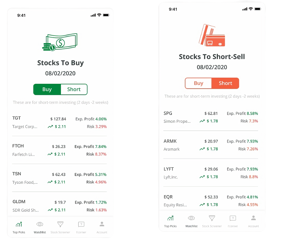
1. Top Picks - Users need a clearer distinction between buy and short-sell lists. Image took too much space which leave less space for stock data and details. Potentially taking out the illustration to provide more room for stock cards and less distraction.
2. Screener - Terms are difficult to understand, especially the advanced section. Include information icons to help aid the definition of more advanced terms.
DESIGN
Let's tackle the pain points one by one↓
Home Screen - Removing the hamburger menu
To improve user navigation, I designed a new bottom navigation bar that Using a bottom navigation bar that provides users with consistent access to key app sections without requiring them to return to a home screen or menu. Our user research has guided this change, revealing the most frequently used features users have when first accessing the app.
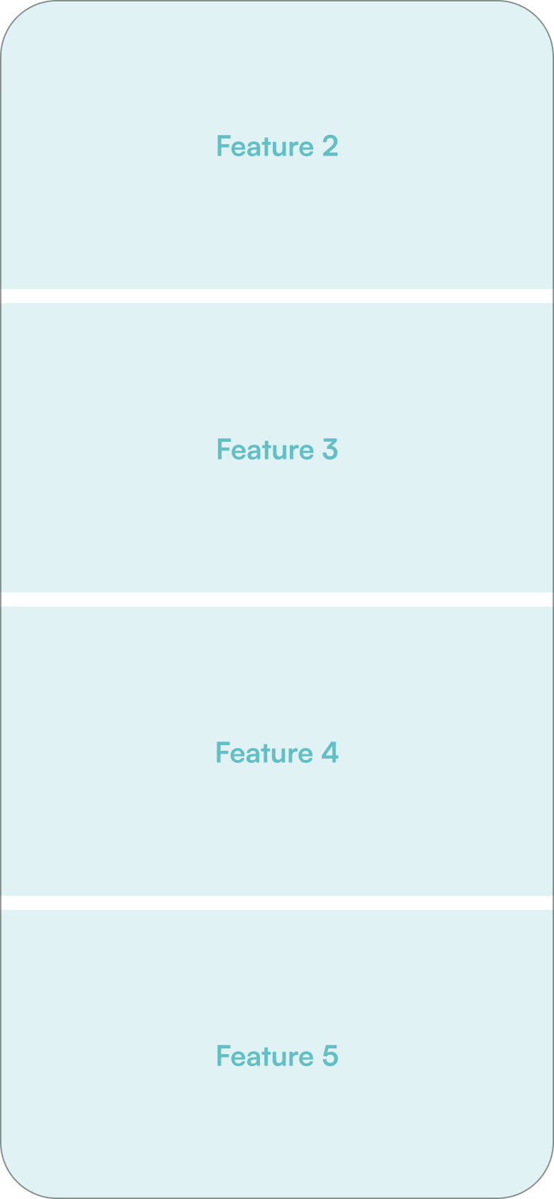

Stock Details - Prioritize content with visual hierarchy
To make the stock recommendation experience more intuitive, particularly for novice users, I enhanced the stock analytics screen by incorporating charts and visual aids. This approach enhances readability, allows for richer content display, and provides a more engaging and intuitive experience.

Top Picks - Quickly scan and compare
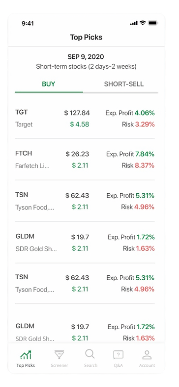
Top Picks is one of our most used features on the app. This page is refreshed daily and contains a lot of useful information that may get lost due to poor visibility. I redesigned the interface by replacing the overwhelming Excel-like list with a more intuitive card-based layout. Each stock is now displayed as a distinct card, allowing users to quickly scan each card.
Search Filters - Reduce cognitive load
Instead of having all toggles for filters, checkboxes and radio buttons are implemented. Users can now quickly scan the options and make selections without having to interpret the meaning of a toggle (whether "on" or "off" is the desired state). This reduces cognitive load and makes the filtering process more straightforward.

Wireframes
I was responsible for creating the wireframes and user flows for Onboarding, Top Picks, Stock Details and Screener.
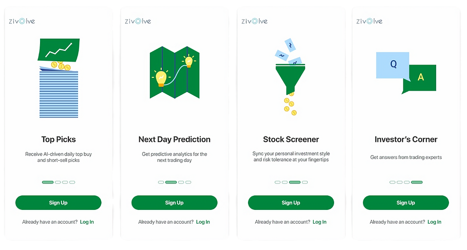
Onboarding
Added 4 new walkthrough screens to help users get familiar with app features in advance. This gives new users an idea of what to expect and what they can do on the app.
Top Picks
User feedback suggested that there’s no clear indication if a stock opportunity is for buying or short-selling. I implemented toggle tabs so users can easily switch between lists.
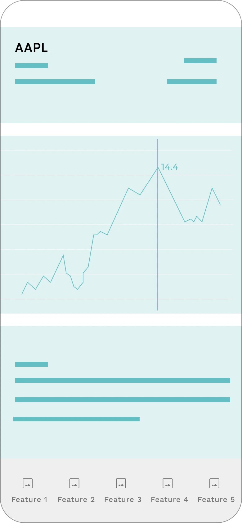
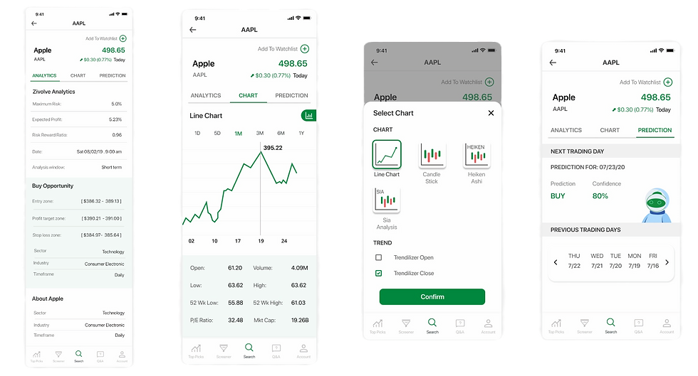
Stock Details
Stock details are now organized to Analytics, Chart and Prediction. These Tabs allow users to quickly navigate between different sections of content without scrolling through a long page.

Screener
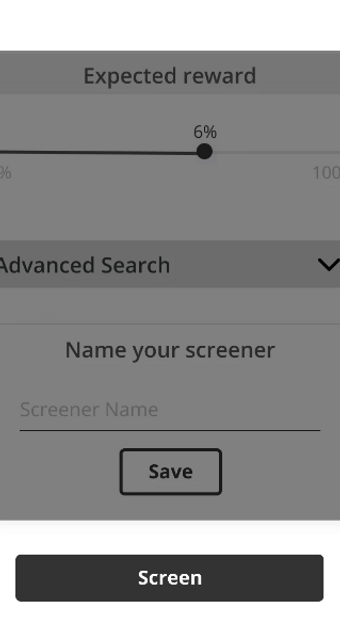
Checkboxes and radio buttons are implemented so users can quickly scan the filter options and make selections. Users can now see their filters selection before they confirm.
USABILITY TESTING
Overview
Zivolve aims at providing optimal trading and investing opportunities to help ease the decision-making process during stock trading. While the beta version was available on the App Store, I was tasked to redesign and improve the stock recommendation experience.
Problem
Zivolve has successfully attracted users with its promise of simplified trading opportunities, user feedback reveals that its stock recommendation interface is not intuitive.
Solution
Enhancing Zivolve's user experience by streamlining the investment decision-making process, making it more intuitive, accessible, and user-friendly for novice investors.
Design Interations
Based on all insights we got from usability tests, some designs only need small changes while some features require whole new structures. I was responsible for creating wireframes and user flows for Onboarding, Top Picks, Stock Details and Screener.
New user onboarding

Top Picks
Image removed to not distract users and to highlight essential information on the page. Today’s date is at the top as the list is updated daily.
Before

After
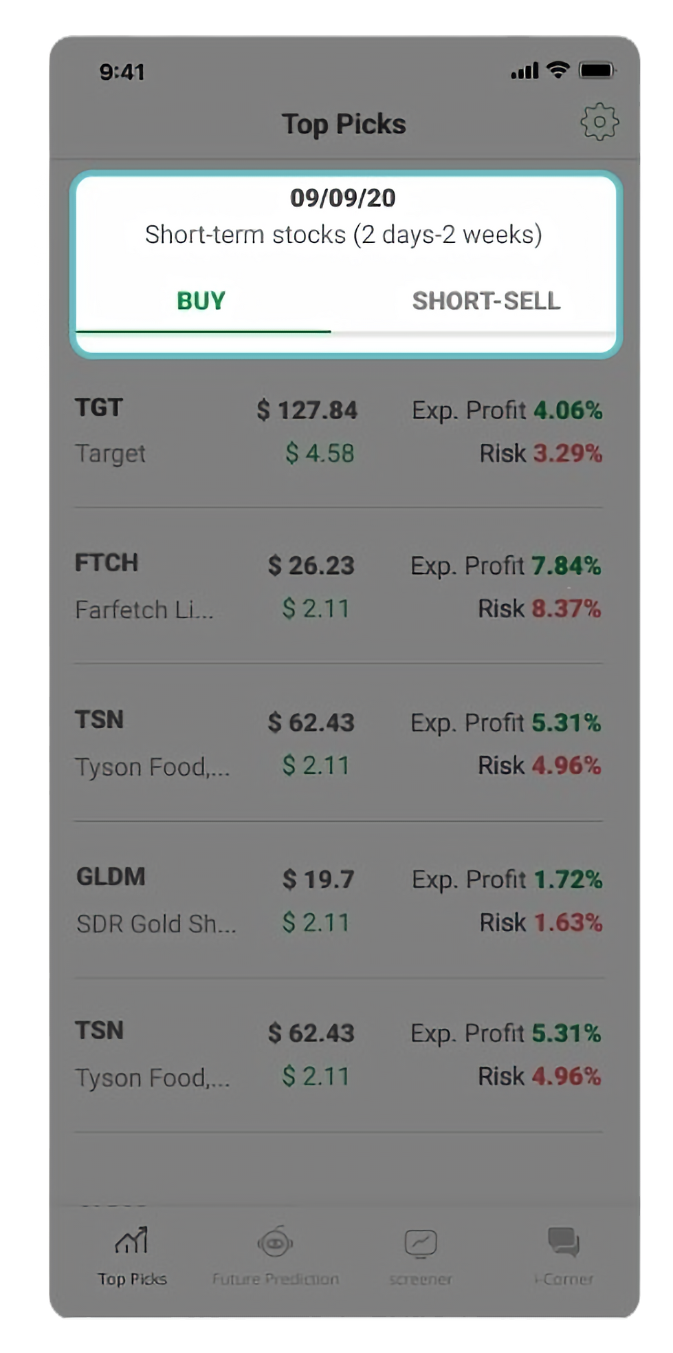
The buy and short-sell lists are now organized using tabs to provide a more intuitive way for users to switch between lists.

Screener
"Search Engine" is redefined as “Screener” since users can adjust filters to screen a list of stocks.
Before
After
Before, users would have to scroll a single long page, make selections and confirm at the bottom without knowing what filters have been selected. I added a summary of selections made before they confirm.

Stock Details
Analytics, Chart and Prediction are now organized in tabs. With content divided into tabs, it's easier to update or modify specific sections without affecting the entire page, allowing for easier maintenance and modular updates. By categorizing information into tabs, users don't need to process all the content at once, which can be overwhelming. Instead, they can focus on one section at a time. When the chart icon is tapped, chart selection is presented.
Final Design
👋🏼 Curious for more?

Played a key role in designing the next generation of Scratch’s lender platform, introducing self-service features. This redesign resulted in a 15% reduction in escalations between Scratch and lenders.

Redesigned information architecture and website to increases leads and conversions. Design process include content audit and strategy, creating a new sitemap and wireframing with content.