PROJECT TYPE
Professional client project at Propane
TIMELINE
February - May 2021
TEAM
Alec Ditonto (UX Director)
Chris Lugo (Senior UX Designer)
Josephine Aldora (UX Designer)
Shelley Tao (UX Designer)
CONTRIBUTION
Content audit
Competitor research
Information architecture
Wireframing
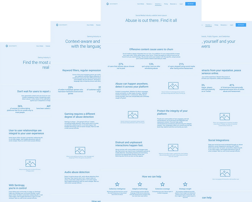
Sentropy.com
Content Moderation Company Website

The Ask
Founded in 2018, Sentropy is a tech company that provides AI-based content moderation solutions to protect online communities and interactions from abuse. Because the sales performance of their existing website is not satisfactory, the ask was for us to create a new company website that increases leads and conversions.
The Result
Working alongside the Strategy and Development team, we successfully delivered a fully revamped website that received positive feedback from the client. The new site effectively highlights Sentropy's role within its industry, demonstrates relevance to organizations of various sizes, educates visitors on the company's value through relevant use cases, and and moves users through the entire customer journey funnel toward demo and sales.
Strategy - where it all begins.
Following a series of workshops and stakeholder interviews, our strategy team developed three key experience pillars to define the website's objectives. These sessions provided alignment within the team.


Our client also identified three prioritized target audiences, providing the UX team, including myself, with clear insights into who our users are, their needs, and the most effective narratives to convey the business's unique value and brand differentiation.


CONTENT AUDIT
Understanding the current narrative
First, I assessed the available content and identified any gaps. Understanding the available content helps in structuring the website’s information architecture. The content dictates how the site is organized, how users navigate and how different pages link together, making it crucial for crafting a seamless and intuitive user experience.
Each team member conducted a content audit of Sentropy's current website and reviewed all the content files provided by the client. We then organized the existing content on a Google Jamboard for easy access, enabling us to collectively decide what to retain and how they could be incorporated into the new information architecture.
To determine what additional content might be needed, I focused on understanding the specific needs of different audience segments throughout the buyer journey. Collaborating with another UX Designer, we created a customer journey map for the top-priority target audience, outlining what users are doing, thinking, and feeling at each stage, as well as identifying key opportunities for engagement.

COMPETITOR RESEARCH
Differentiation and Positioning
As I began considering the narratives and presentation for the website, several questions arose. To gain clarity, I researched how Sentropy's competitors address similar challenges on their websites, focusing on identifying both the strengths and weaknesses in their design approaches.
What are direct and indirect competitors doing?
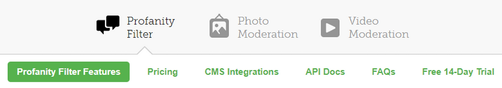
Hive Moderation and WebPurify categorize products by content types, such as text and audio. While this approach is straightforward, it lacks emphasis on their capability to integrate multitype content moderation seamlessly.
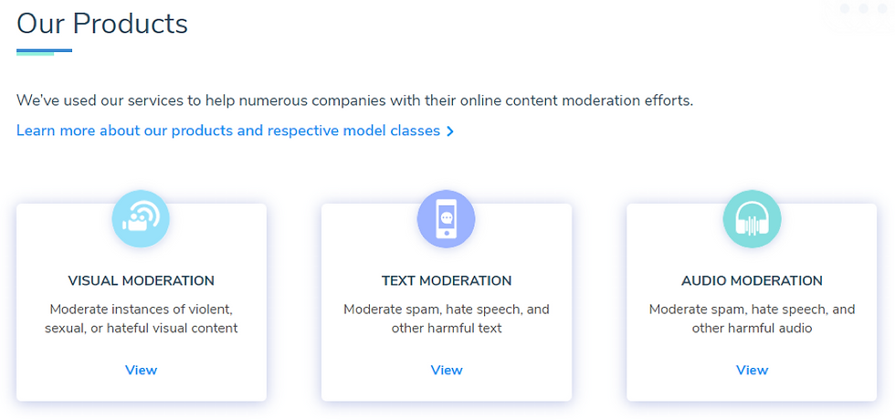
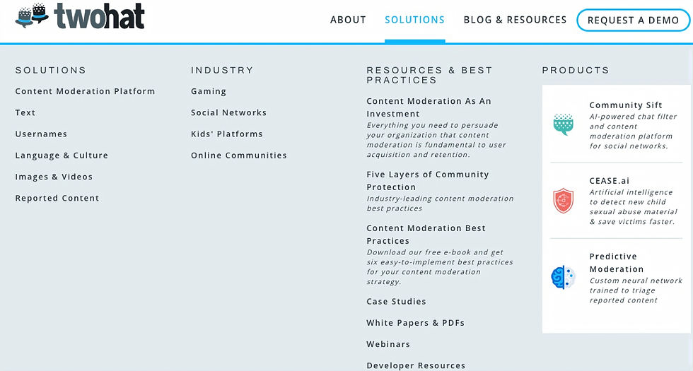
Two Hat presents both "solutions" and "products" without clearly defining the distinction or relationship between them, potentially leading to user confusion. However, their industry-specific content resonates well with diverse user groups.
Clarifai and Apprenda effectively use visual illustrations to map out their platform structures, enabling users to better grasp how products and features fit within the broader platform or ecosystem.


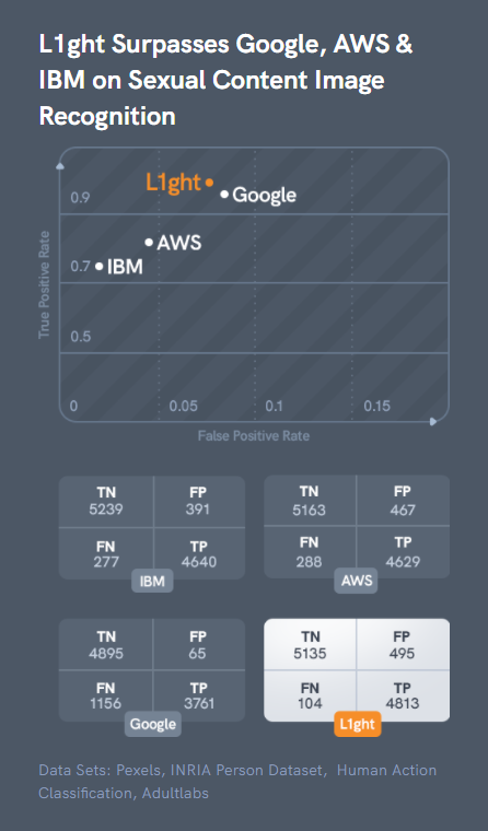
Two Hat, Clarifai, and Spectrum Labs emphasize the user benefits of AI, minimizing technical details, whereas L1ght takes the opposite approach, showcasing metrics, graphs, and industry-specific jargon. This contrast likely reflects differences in their target audiences.
Hive Moderation carefully tailors its language by substituting "AI" with "automated" and humanizing the technology with phrases like "human-level accuracy" and "human-level understanding."
Noodle.AI offers three distinct descriptions of their AI technology—labeled "Normal," "PhD," and "Robot"—allowing users to choose the level of detail they prefer.

Hive Moderation features a dedicated "client-led benchmarking" page, highlighting an internal study with Reddit that compares its precision against Amazon Rekognition, Microsoft Azure, and Google Cloud’s Vision API, supported by data-driven graphs. While this approach builds credibility and trust, it lacks broader applicability to other clients or scenarios.
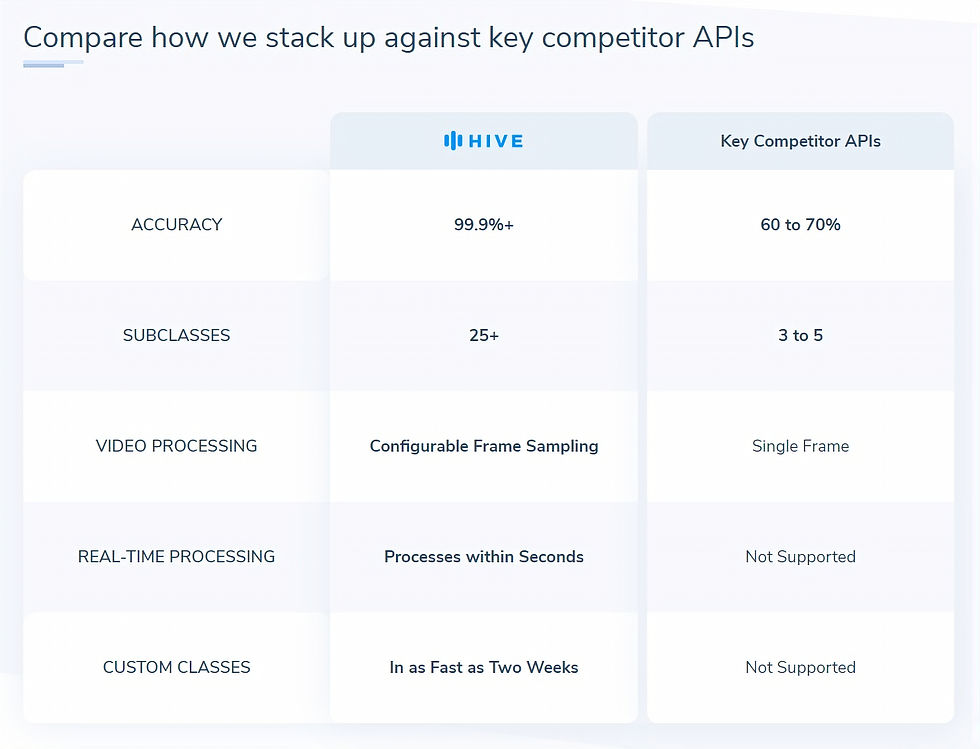
In addition, Hive Moderation uses concise tables to compare key competitor APIs across dimensions such as accuracy and custom classes. This provides users with a clear, straightforward comparison of essential features that are likely to influence their decisions.

L1ght employs graphs and charts to compare technical metrics, such as true and false positive rates in image recognition and levels of protection, against competitors like Google, AWS, and IBM. This data-driven approach is can be effective when addressing a highly technical audience.


Designing Information Architecture
The primary challenge at this stage was to organize, label, and present the product and service offerings in a way that accurately reflects the business while remaining intuitive for startup management users. To achieve this, we engaged closely with the client’s sales and engineering teams to gain a deep understanding of their offerings and refine them accordingly.
Before

In the existing information architecture, the distinction among the four products was unclear, and the structure did not account for prioritizing target audiences effectively.
After

To address these challenges, we restructured Sentropy's "platform with products" into a "solution with features."
We also collaborated on renaming the features to provide clearer definitions and better align them with key user personas.
Next, we conducted a comprehensive overhaul of the website structure to streamline the buyer journey, with the goal of allowing users to move seamlessly through the buyer journey and find the information they need at each stage.
Specifically, the new website structure:
-
Explains in detail how the product works and how users might utilize it to achieve their goals;
-
Gives each product feature a dedicated page, allowing users to better understand what each one offers and how it might meet their needs;
-
Directs users in different industries to pages that talk specifically to them;
-
Makes it easy for users to find pricing information before they proceed to leads.
New Sitemap ✨

Old Sitemap

Ideas to action: Wireframing with content
Ensuring alignment with the client
Before wireframing the pages, we created zone diagrams to strategically define the narrative, establish the goals and messaging for each section, and identify the necessary content. This process also facilitated client feedback to ensure alignment with the overall vision.
Zone diagram - Homepage

Zone diagram - How it works

Navigation design
As we transitioned to wireframing, I was responsible for designing the navigation while collaborating on the sitemap. By creating quick wireframes, I helped the team efficiently explore and test various options, making it easier for both the client and us to visualize and refine our ideas.

Collaborative ideation workshops
We conducted ideation sessions to generate wireframe concepts, consistently revisiting the three experience pillars to ensure alignment and enhance the overall website user experience. I particularly enjoyed these sessions as they encourage diverse perspectives and creative solutions. This process also helped in ensuring that all design concepts are aligned with the core experience pillars, maintaining consistency with the project’s strategic goals.

Pillar #1: Define and Embody the New Standard
Sentropy aims to set a new benchmark in the industry. Our approach involves two key strategies: first, educating users on the limitations of their current solutions, and second, presenting Sentropy as the new standard through a compelling and relatable narrative.
We accomplished this by refining our brand and product messaging in collaboration with the client, highlighting success through case studies and testimonials, and delivering industry-specific content to clearly define the new standard for users across various sectors.
Case studies

Testimonials

Industry-specific pages
Pillar #2: Simplify Technical Sophistication
Technical jargon can be a barrier to understanding. Our approach focuses on highlighting benefits rather than detailing features. We developed benefit-focused sections to clearly communicate the value of advanced technology to users. Additionally, we incorporated mini product demos throughout the website to visually demonstrate how Sentropy makes an impact.
Benefits blade example

Mini product demo example

To bring all the features together and illustrate the concept of an integrated ecosystem, we created a layered illustration inspired by the Sentropy logo. This design approach was inspired by insights gained from the competitor research I did earlier.
Illustrating features as layers

Pillar #3: Position as Deeper than...
Sentropy's solution is "deeper" than its competitors and internally-developed solutions. I collaborated with the team to generate ideas, resulting in the development of an interactive demo on the homepage and comparison charts on the feature pages, among others. These elements effectively showcase Sentropy’s superior and comprehensive approach.
Interactive demo

Comparison table for detection solution

After several rounds of client feedback, we finalized and delivered 19 screens to the copywriter and creative design team for further development.

Reflection
Balancing business and user needs
While I have always recognized the connection between business and design, I am continually impressed by how integral design is to achieving business objectives, particularly in an agency setting. Clients engage us to address their business challenges, such as increasing leads and driving sales, yet as a designer, it's essential to consider both business goals and user needs. Striking the right balance between these priorities is key to delivering impactful design solutions.
Considering the needs of website users vs. product users
I’ve learned that when designing a B2B marketing website, it's essential to recognize that website visitors are often different from the end-users of the product. In this project, for example, the website will attract startup management and IT procurement professionals who are making purchasing decisions for their trust and safety teams. Therefore, the website must resonate with these decision-makers while also understanding the needs of the end-users, such as trust and safety teams, to ensure comprehensive effectiveness.
Design is a non-linear journey
While this case study might present the process as linear, the reality was quite different. For instance, when we began zone diagramming and wireframing, we discovered new ways to improve the information architecture, prompting us to revisit and refine it multiple times until both we and the client were satisfied. Additionally, tasks like content design and competitor research continued throughout the project, beyond the initial design phase.
This experience taught me to embrace the uncertainty inherent in the design process, allowing me to let go of assumptions and ideas as the project evolved.
👋🏼 Curious for more?
Played a key role in designing the next generation of Scratch’s lender platform, introducing self-service features. This redesign resulted in a 15% reduction in escalations between Scratch and lenders.
Refining an intelligent stock trading assistant app's user experience to make investment decisions more accessible and user-friendly for novice investors.