PROJECT TYPE
Professional project at Scratch
TIMELINE
June - August 2022
TEAM
Josephine (Product Designer)
Shivam (Product Manager)
Mateusz (External Developer)
CONTRIBUTION
UX research
Wireframing & prototyping
Design handoff
Scratch.fi
Borrower Loan Repayment Portal

Background &
Problem
The previous design for the Borrower portal did not meet compliance requirements. Our loan guides received numerous calls from borrowers who struggled to confidently manage and make payments on their loans on the portal. The old version of the borrower portal was text-heavy and lacked a clear structure, making it confusing for borrowers, particularly those with multiple loans.
Key Result
The new compliant Borrower portal offers borrowers a clear and concise view of their overall debt journey. The redesigned layout includes grouping active and inactive loans for easier navigation and a clear snapshot of each loan status. Borrowers can now use the Autopay feature to set up automatic payments. Following the implementation of the new and improved design, we saw a 20% reduction in support calls from borrowers within the first three months.
Improving the Borrower Repayment Portal
1. Identifying the Problem
The borrower portal on Scratch’s platform was not compliant, specifically lacking a key requirement: providing borrowers an aggregate view of their overall loan journey. Compliance requirements dictated clear communication of loan statuses and payment schedules, which the existing portal struggled to deliver effectively.
The existing portal design also lacked the necessary structure and clarity. Our loan guides received a high volume of calls from borrowers having difficulties managing and making payments through the portal, particularly those with multiple loans. These issues were leading to borrower dissatisfaction, missed payments, and an increased reliance on customer support.
2. Research: Looking into compliance requirements and customer support data
I started with some research to better understand the problem. This research phase was crucial in identifying gaps in the borrower journey and ensuring the redesign would both meet compliance needs and enhance usability. Through this research, I also found other issues relating to the loan forbearance application process. Many borrowers had started the application but failed to complete it. This prompted me to look into the loan forbearance application process and uncover pain points in the user flow and identify screens where borrowers were "stuck".
🔍 Key research activities:
Compliance Requirements & Data Collaboration
I conducted research on compliance requirements and collaborated closely with the Product and Data teams to pull essential loan data, such as total payoff amount, total interest paid, and blended interest rates.
Customer Support Data
I analyzed borrower support requests and discovered recurring issues with portal navigation and lack of clarity around total loan progress made, particularly for borrowers with more than 1 loan. Servicing notes also revealed key pain points, such as difficulty interpreting loan statuses and confusion around the loan forbearance process.
Benchmarking
I conducted a competitive analysis of similar loan management platforms to identify industry best practices and opportunities for improvement.
3. Ideation
Based on the research findings, the following compliant design improvements were proposed:
-
Clearer loan status indicators using intuitive language like "Past Due," "Payment Due," and "No Payment Due" to reduce borrower confusion.
-
Enhanced visual hierarchy to prioritize key information, such as upcoming payment dates and outstanding balances.
-
Simplified homepage where borrower can view to an aggregate view of their loan journey and access individual loan details easily.
I developed early-stage wireframes to explore these solutions, with a focus on ensuring compliance and presenting essential loan information.
4. Evaluation
The proposed design solutions were evaluated for meeting borrower needs and compliance requirements. Key considerations included:
-
Feasibility: Collaboration with the development team to ensure that proposed changes could be implemented within the given timeline.
-
Impact: Priority was given to features that directly addressed the most critical borrower pain points, while ensuring that compliance-related elements, such as payment schedules and loan statuses, were clearly communicated.
The evaluation process resulted in a clear plan to move forward with a streamlined, user-focused design.
5. Prototyping
These prototypes were shared with stakeholders for initial feedback and were reiterated and prepared for handoff. Design updates:
New Designs for the Borrower Repayment Portal
Overview Card
Helpful Tooltips for Clarity
I added tooltips to explain more complex terms like "blended interest rate". Borrowers can hover over the info icon for a quick explanation.

This new Overview Card design ensures the Borrower Repayment Portal is fully compliant while catering to borrowers with multiple loans — a common scenario for many of our users. It provides a clear, consolidated view of their loan journey.
Overview Card - Located on the homepage, the overview card gives borrowers a concise view of their overall loan status:
-
Total remaining due for the month and number of payments owed
-
Total debt or payoff amount
-
Total interest paid to date
-
Individual or blended interest rates for all loans


Individual Loan Cards - Each loan is presented as a card that highlights key information, including:
-
Loan ID, loan status, payment amount due, and due date for the current installment
-
"Make a Payment" button for quick action
-
Autopay status with an option to enable or disable it
Individual Loan Cards
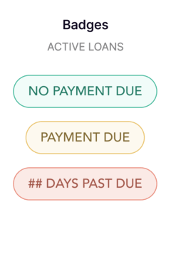
Loan Status Badges
To provide borrowers with a clearer understanding of their loan status, each loan now displays a badge next to the Loan ID. I've replaced internal terms like Delinquent, Current, and Satisfied with clear, borrower-friendly language:
-
Past Due: The loan is delinquent, meaning payment is overdue. The badge clearly displays how many days they are past due (e.g., 10 days past due).
-
Payment Due: A payment is upcoming for the current installment period.
-
No Payment Due: The loan is fully up to date, and no payment is required at this time.
Loan details page can be accessed by clicking on a loan card. Borrowers can also click on the make a payment button for quick action.


Loan details
Make a payment
Autopay Feature
I also designed a seamless autopay feature that allows borrowers to automatically schedule payments for their loans. Borrowers can now easily turn autopay on or off directly from the loan card, enhancing convenience and giving them more control over their payment schedules. This feature simplifies loan management and helps reduce missed payments, improving overall borrower satisfaction.

Grouping for Active & Inactive Loans
In the old borrower portal, borrowers with multiple loans struggled with finding active loans with ongoing installments. This was due to the confusing text-heavy interface and unlabeled loans. The redesigned layout includes grouping active loans together (Ongoing Installments) and inactive loans in a separate section (Inactive Loans) for a clearer organization and structure, and providing borrowers with a clear snapshot of their loan status.

Streamlining the Forbearance Application Process: Design Updates to Improve Borrower Clarity and Usability
What is a Forbearance?
Forbearance is a temporary pause or reduction in loan payments that gives borrowers a little breathing room during financial challenges. Instead of falling behind on payments, our borrowers can apply for a forbearance plan. Our lenders offer a variety of forbearances and accommodations to borrowers, ranging from general financial relief to more specific loan modifications, depending on individual needs.
1. Uncovering the Roadblocks
Borrowers frequently contacted our customer support team regarding the loan forgiveness application process. A major issue was that many borrowers mistakenly believed they had submitted their application after reaching the 'Final Review' screen, only to realize later that the application had not been completed. Other concerns included broken links throughout the application, outdated lender forbearance options, and unclear application status, all of which contributed to borrower frustration and increased support requests.
2. Design Audit & Findings
I did a comprehensive audit of all screens in the loan forbearance application process. Additionally, I completed the application myself as a borrower to understand what borrowers went through from application start to finish. I discovered the following issues:
-
Broken links across all application flows, leaving borrowers unable to access critical resources.
-
Confusing submission process, especially around the 'Final Review' screen, where borrowers assumed their application was complete.
-
Outdated lender forbearance options, leading to mismatched borrower expectations.
-
Unclear progress indicators, with the application showing “In Progress” even though critical steps were missing.
-
Misaligned button placement, making navigation cumbersome.
3. Design Solutions & Improvements
To resolve these issues and improve the overall borrower experience, I implemented the following design updates:
-
Fixing Broken Links
I collaborated with Platform Ops to update to fix all broken links throughout the application, ensuring borrowers had access to the correct resources.
-
Enhancing Application Clarity
I added new copy to the 'Final Review' screen, clarifying that additional steps were required before submission.
The application progress badge was updated to show “Incomplete” when necessary steps hadn’t been completed, reducing misunderstandings.
-
Updating Forbearance Information
I worked with Platform Ops to ensure the application accurately reflected lender-specific forbearance options and documents requirements to qualify for these accommodations.
-
Improving Usability & Navigation
I updated call-to-action buttons to ensure they remained accessible during scrolling, enhancing usability. The overall structure was updated to guide borrowers more intuitively through the process.


User Flow - Borrower applies for accommodations
User Flow - Lender ops reviews application
Updated Forbearance Process
Updated Forbearance Types Offering


Forbearance Application - Wireframes

4. Final Designs: Forbearance Application
I conducted a thorough audit of the Forbearance application to eliminate borrower confusion and enhance the user experience. I addressed key issues such as broken links across multiple flows, updated progress indicators, and added clear instructions on critical screens to guide users.
Additionally, I designed five forbearance flows based on different hardship options and created two different workflows for borrowers with and without co-borrowers to ensure a seamless application experience.
These updates resulted in more accurate applications, fewer late submissions, and reduced loan delinquency.
Start Application
Select Hardship


Select Forbearance Payment Option
Final Review & Submit Application


5. Key Results & Impact
Reduced Borrower Confusion
Clarified the submission process by adding explanatory text and adjusting the progress badges, helping borrowers understand where they were in the application process.
Streamlined Access
Updated all broken links and ensured resource accuracy, significantly improving the accessibility of important information.
Enhanced Usability
Adjusted button placements and page structure to improve the application’s structure and ease of use.
Improved Lender Alignment
Ensured that lender-specific forbearance options were correctly displayed, enhancing borrower-lender transparency.
These updates resulted in more accurate applications, fewer late submissions, and reduced loan delinquency.
👋🏼 Curious for more?
Played a key role in designing the next generation of Scratch’s lender platform, introducing self-service features. This redesign resulted in a 15% reduction in escalations between Scratch and lenders.
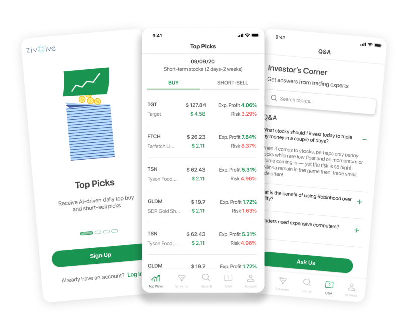
Refining an intelligent stock trading assistant app's user experience to make investment decisions more accessible and user-friendly for novice investors.